Winter’s Back, and a look back to Winter.
5th April 2021

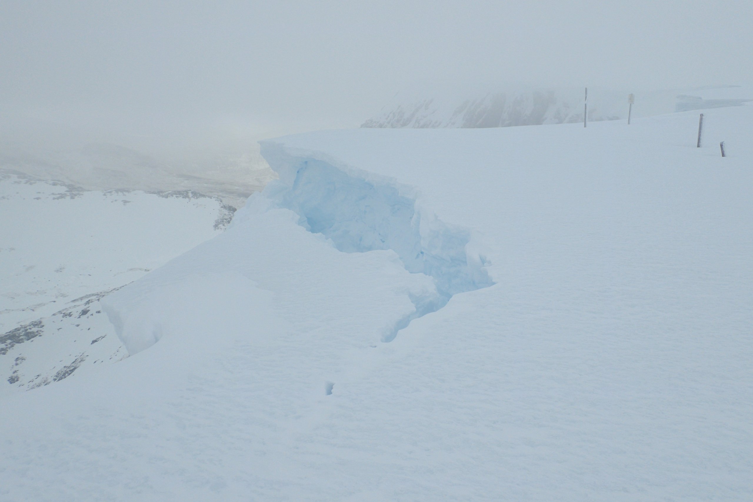
Slumping Cornices. Although now frozen solid in the colder conditions, at some point it will start to thaw again in which case features like these will be very prone to collapse.

The view into Coire an Lochan. Notice the crack in the snow below the crags. Under the snow lies a smooth granite slab. In the mild wet conditions the snow starts creeping and slowly sliding down the slab which is lubricated by melt water. A crack then forms between this and the snow higher up which is held in position by a much rougher substrate. This crack is unlikely to lead to an avalanche due to the underlying topography (a large bank of rock and earth just below this slab). However in other locations, such as the great slab in Coire an Lochan in the Northern Cairngorms, a full depth avalanche running on a smooth slab occurs most years in the the spring.
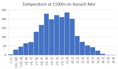
A histogram of the air temperature at 1100 metres on Aonach Mor in 1 degree Celsius bins. The data shows the 2160 hourly temperatures where taken between the 1st of January and the 31st of March. Both the mean and median values are -2.4°C.  The lowest was -11.4°C, and the temperature was below 0°C about 75% of the time. It was above 2°C 10% of the time, and below -7.0°C 10% of the time. The data is kindly supplied by the Scottish Association of Marine Science in Oban. It comes from a device that has been developed to monitor snow properties. The original device, called SIMBA, was designed for sea ice work, and used successfully on the likes of the MOSAiC project (that is the project a couple of winters ago when a ship froze itself into the arctic ice and drifted with the ice through the winter). In terms of application to snow, it can be used to automatically monitor conditions and snow properties in locations/at times that are too hazardous or remote for humans to access.
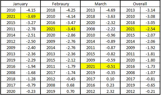
The table above shows the average Aonach Mor midday summit temperatures for the central three months of the avalanche season (January to March) for the past 14 years ranked in order of coldest to mildest. This year’s results are highlighted: January was the 2nd coldest, February the 4th coldest and March the 10th coldest (5th warmest). The final column is for the three months combined, this year was the 4th coldest out of last fourteen, not too bad (for modern times). The data for this chart comes from met office weather station (not the SAMS device mentioned in the previous figure or the holfuy station mentioned right at the beginning of the post) and is recorded on the daily SAIS snowpit. Â
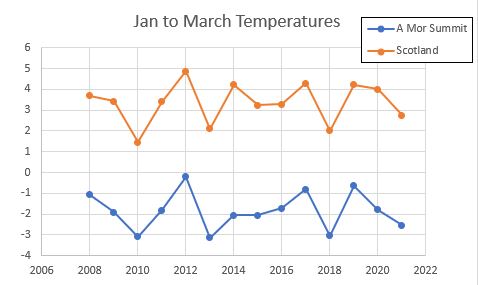
The blue line in this chart shows the combined January to March temperature (the same data as in final column of the previous table) in graphical form. The orange line show the average Scotland temperature as recorded by the met office for the same period. This data comes from the met office, and can be freely downloaded from their website. As can be seen there is good correlation between the two plots over this time period. The cold winters of 2010, 2013, 2018 and 2021 show up in both, as do the mild winters of 2012 and 2017 and 2019. The advantage of the met office data is that their data set goes back a lot further, which leads on the next graph…
Looking at the whole met office data set for Scotland’s January to March temperature, the trend is generally up. Before about 1989 (about the time the SAIS started), the January to March period was rarely above 4°C, it happened about 6 times from 1885 to 1988. Since 1989 it has happened about 13 times. Of the 12 warmest January to March periods, 11 of them have happened since 1989. Given the correlation seen in the previous figure, if we had Aonach Mor summit data going back to 1885, we would see a very similar trend. On a slightly less depressing note (for someone who likes snow) this year the January to March temperature was slightly colder than average. It was +2.8°C which ranks as 65th in the 136 years dataset. I find it interesting to note that the period between about 1945 and 1965 seems to show more variability in temperature than other periods. However, it is getting a bit above my pay-grade to start commenting or speculating on thing like that, I am just a humble snow-proder who likes graphs and weather!
Comments on this post
Got something to say? Leave a comment


That Guy from The Internet
5th April 2021 7:31 pm
I totally geek out on stuff like this, Blair.
…and no, you’re quite a lot more than snow dirtbag who likes graphs and weather!
Many thanks for putting this all together.
Windsock Nerd
5th April 2021 10:33 pm
Have you thought about combining the historic âJanuary to March Temperatureâ with sunspot activity and Milankovitch cycles?
Phil Marsh
7th April 2021 11:11 am
Really interesting set of data and notes, many thanks.
That other guy from the internet
7th April 2021 5:41 pm
I recall reading in one of Martin Moran’s books something about the airflow becoming more SW dominant around 1987 providing us wit more milder winters. That would seem to fit into the last graph.
Colin Wells
7th April 2021 8:20 pm
Great stuff and really interesting – appreciate the time you’ve put into this (and all your other stat-rich commentary – not often you learn things from blogs!). Cheers, Col
lochaberadmin
12th April 2021 2:43 pm
Thanks for all the comments folk, glad that you find my stats interesting.